
Profit and Loss
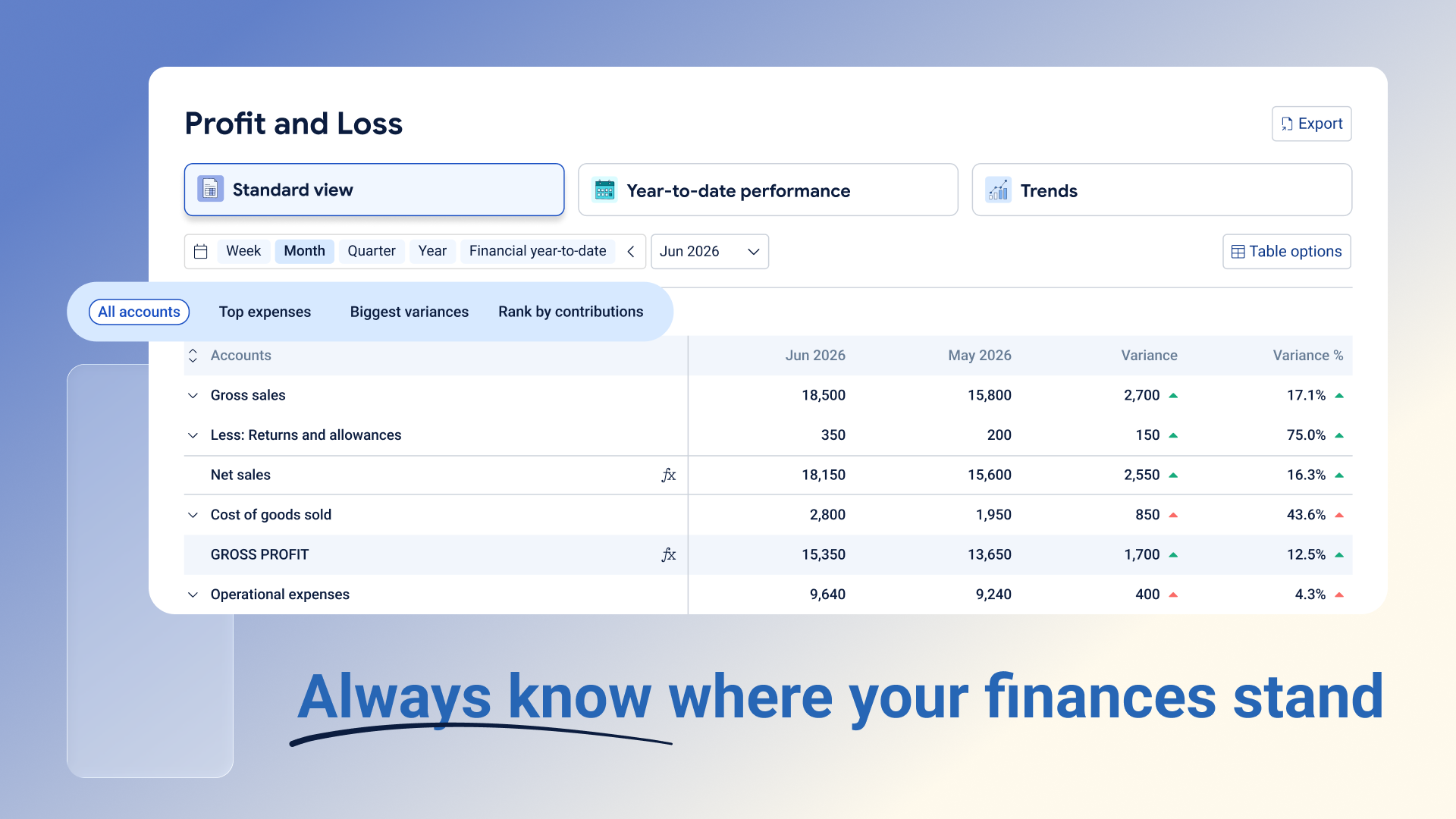
Your Profit and Loss (P&L) report shows how much money your business made and spent over a chosen period, and whether you ended up with a profit or a loss. This article walks through where to find it, the three ways you can view it, and how to customise it to get the insights you need.
Where to find it
Go to Posted → Accounting → Profit and Loss.
Only users with the Owner or Accountant role can access this report.
The three views
At the top of the page you'll see three view cards: Standard view, Year-to-date performance, and Trends. Click a card to switch views — the active one is highlighted.
Standard view is the classic P&L for a single period, with a comparison column so you can quickly identify what changed and why.
Year-to-date performance shows how the business has performed from the beginning of the financial year up to the selected period. It places the current period alongside the current and prior financial year-to-date figures, helping you compare performance with the same point in the previous financial year.
Trends display your profit and loss across multiple periods, making it easier to identify patterns, fluctuations and changes over time. Depending on the selected options, you can review individual periods alongside the total and average for the full period range.
Choosing a time period
Just below the view cards, use the period buttons (Week, Month, Quarter, Year, Financial year-to-date) and the date picker to set the period you want to look at. The report opens showing the current month by default. The available time period options depend on the view you are using.
Customising the table
Click Table options (top right) to adjust how the report looks:
Comparison options — compare this period to the one before it, to the same period last year, or turn comparisons off.
Variance options — show the difference as a dollar amount, a percentage, both, or hide it.
Format options — reorder your accounts, group accounts together, add a heading, add a blank row, or add a new account.
These settings are remembered as you switch between time periods, so you don't need to set them up again each time.
Reading the numbers
A green up arrow (▲) generally means good news, and a red down arrow (▼) means the opposite — this holds true whether you're looking at sales or expenses, so you don't need to remember different rules for different account types. If there's nothing to compare against (for example, a brand new account), you'll see a dash (–) instead of a percentage.
Bold rows like Gross profit, Operating income, and Net profit are automatically calculated totals — you can't edit or move these, but you can collapse and expand sections using the arrow next to the Accounts column.
Drilling into the details
Click any blue, clickable amount in Standard or Year-to-date performance view to see the individual transactions that make up that number, right underneath the row. The first transactions displayed are the ten largest by value, with the option to load the complete transaction list. From there you can reassign a transaction to a different account, or remove a transaction from the list. Click the Show all transactions icon to see the complete list in a new tab.
Exporting your report
Click Export (top right) and choose Excel, Google Sheets, or PDF. Whatever you export will match exactly what's on your screen, including your chosen period, view, and formatting.
A few things to keep in mind
Zero-balance accounts are hidden automatically. If there's no data for the period you've selected, the report will show dashes or a message letting you know. And since the report pulls directly from your transactions and chart of accounts, any changes you make (like reassigning a transaction) will automatically update the numbers here too.
Use each view to answer different questions
Each view card also has filtered versions you can jump to using the pill buttons underneath, such as All, Top expenses, Biggest variances, or Rank by contribution — these highlight specific slices of the report instead of showing everything at once. These were designed to tell the story behind the numbers.
Filters in Standard view
All accounts show your full profit and loss statement for the selected period, together with any comparison and variance columns you have chosen.
Use this when you want a complete view of your income, expenses and profit for a specific period. It is a useful starting point for monthly reviews and general performance checks.
Top expenses show up to the ten largest expense accounts for the selected period, starting with the highest.
Use this to quickly see where the business is spending the most. It can help you identify your main cost areas, spot increases and decide which expenses may need a closer look.
Biggest variances highlight the accounts with the largest positive and negative changes compared with the selected comparison period.
Use this when you want to understand what has changed without reviewing every account. It helps you quickly find the movements that had the biggest impact on performance.
You can view these changes as an amount, a percentage or both.
Rank by contribution shows how much each account contributes to a larger total. For example, it can show an expense as a percentage of total expenses or sales.
Use this to understand which accounts make up the biggest part of your income or costs.
Filters in Year-to-date performance
All accounts show your full profit and loss statement for the selected period, together with the current and prior financial year-to-date figures..
Use this to compare the latest month or quarter with the business’s overall performance for the financial year. It helps you see whether the current period supports or differs from the wider year-to-date picture.
Variances show the changes for both the selected period and the year-to-date results.
Use this to see whether a change only affected the current month or quarter, or whether it forms part of a wider pattern. For example, one weaker month may be less concerning if the year-to-date result is still ahead of the previous year.
View variances as amounts to understand the financial impact, or as percentages to compare the size of changes across different accounts.
Filters in Trends
All accounts shows your full profit and loss statement across several periods, with each period displayed in its own column.
Use this to see how income, expenses and profit have changed over time. It can help you identify recurring patterns, seasonal changes and unusual periods.
You can choose how many periods to display, change the order of the columns and add an average to make comparisons easier.
Trend growth compares the selected period with the average performance for a similar period during the year.
Use this to see whether the latest week, month or quarter is performing above or below what is typical for the business. It can help highlight stronger sales, unexpected increases in expenses or early changes in performance.
Since the comparison is based on an average, it is less likely to be affected by one unusually high or low previous period.